

The Ultimate Guide to Color Selection in Home Painting: Transform Your Space with the Perfect Hues- 2024
When it comes to home painting, color selection is one of the most important—and often overwhelming—decisions to make. The right color can transform a room, set the mood, and even make a space feel larger or cozier. Whether you’re repainting a single room or updating your entire home, understanding how to choose the right color palette can make all the difference in achieving the perfect ambiance.
Here’s a guide to help you navigate the process of selecting colors for your home, ensuring that every room feels both functional and beautiful.
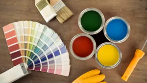
Table of Contents
1. Understand the Psychology colour of home painting
Color is more than just a visual experience; it has the power to influence our mood and emotions. Different colors evoke different feelings, which is why understanding the psychology of color is essential in selecting the right hues for each room:
- Blue: Often associated with calmness and tranquility, blue is an ideal choice for bedrooms, bathrooms, or any space where you want to relax and unwind. Lighter shades like soft blues can make a room feel airy and spacious, while deeper blues bring warmth and serenity.
- Yellow: A cheerful and uplifting color, yellow is perfect for kitchens, dining areas, or hallways. It creates a welcoming, energetic atmosphere but should be used in moderation—too much yellow can feel overwhelming.
- Green: Known for its calming and restorative properties, green is a great choice for living rooms and bedrooms. It’s the perfect color for connecting with nature and promotes a balanced, peaceful vibe.
- Red: A bold, stimulating color, red is often used in spaces where energy and excitement are desired, such as dining rooms, kitchens, or home offices. It can also make a room feel cozy and intimate, but too much red can feel intense.
- Gray: Versatile and timeless, gray works in almost any room. It’s neutral and can be both soothing and sophisticated, often used as a backdrop to allow other design elements (like furniture or artwork) to pop.
- Neutral Tones (Beige, White, Taupe): These colors create a sense of calm and cleanliness. They’re particularly great for living rooms, bedrooms, or spaces where you want flexibility and to complement other design features. Neutrals work well with any accent color and provide a timeless appeal.
2. Consider Room Function and Size
The function and size of the room should play a crucial role in color selection. Lighter shades like whites, creams, and pastels are ideal for small spaces because they reflect light and can make the room feel larger and more open. If you’re working with a large room, you may want to use deeper tones or accent walls to create a more intimate, cozy environment.
- Small Rooms: Use lighter shades of colors, such as soft whites, pastels, or light grays, to make a room appear more expansive. Vertical stripes or mirrors can further enhance the illusion of space.
- Large Rooms: Darker shades or deeper hues can add warmth and make a large room feel cozier and more inviting. Don’t be afraid to experiment with bold accent walls or complementary colors for a dynamic look.
3. Lighting Matters
The amount and type of light a room receives can greatly affect how colors look. Natural light brings out the true tone of paint, while artificial light can make colors appear differently depending on its warmth or coolness.
- Natural Light: Rooms that get plenty of sunlight are perfect for bold or dark colors, as they won’t make the space feel too closed in. However, be cautious with bright colors like yellow, which can look overly intense in direct sunlight.
- Artificial Lighting: Incandescent light tends to bring out warm tones in colors, while fluorescent light often gives off a cooler, bluish hue. If you have lots of artificial light, test your color choices in both daylight and nighttime conditions to see how they look.
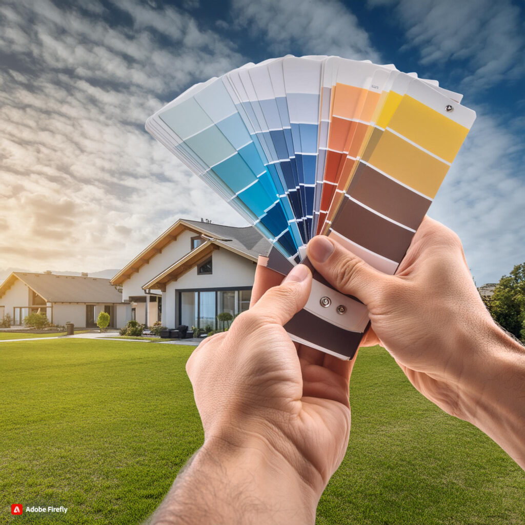
4. Create Flow with a Cohesive Palette
While it’s tempting to choose different colors for each room, it’s important to create a cohesive flow throughout your home. A unified color scheme helps your home feel connected and balanced. You can either use complementary colors, which sit opposite each other on the color wheel (like blue and orange), or analogous colors, which sit next to each other (like blue and green).
If you’re unsure where to start, consider using one color throughout the home in different shades. For example, varying tones of blue or gray can create a serene, cohesive look. Accent walls or subtle shifts in tone can differentiate rooms without making them feel disjointed.

5. Test Before You Commit
Color on a paint sample card often looks different once applied to your walls. Always test paint colors in small sections of the wall before making a final decision. Observe the paint under different lighting conditions throughout the day to ensure it’s the color you want.
Consider buying small sample cans of paint and trying out a few shades in the space you’re working with. Paint large enough sections of the wall so you can see how the color looks in both natural and artificial light.
6. Trends vs. Timeless Choices Related Home Painting
While it’s fun to incorporate trendy colors, it’s important to remember that colors are subjective and personal. Choosing a paint color should reflect your style and the mood you want to create in the space. If you’re worried about a color feeling outdated, opt for a timeless palette that you won’t tire of in a few years.
However, if you love a specific color trend—such as Pantone’s Color of the Year—consider using it as an accent color rather than covering entire walls in it.
7. Consider the Overall Design Aesthetic
Finally, consider your home’s overall design aesthetic. Are you drawn to a modern, minimalist style? Then neutral tones, whites, and blacks might be more fitting. If your style leans toward vintage or traditional, deeper, richer hues may work better. Whatever your style, ensure that the paint color you choose complements the furniture, artwork, and other design elements in the room.
Conclusion Of Home Painting
Selecting the perfect color for your home is both a creative and thoughtful process. The right color can enhance the space, set the tone for your day, and create an atmosphere that suits your lifestyle. By understanding the emotional impact of colors, considering the function of the room, testing your choices, and staying true to your style, you can create a home that reflects your personality and feels comfortable for years to come. Happy painting!
Call to Action: Ready to protect your home? Contact us
today for expert advice and high-quality waterproofing solutions tailored to
your needs!
Check out our Blogs
Check out our Instagram
www.royalpainters.in/painting-maintenance-tips

Leave a Reply